Automatic language translation
Our website uses an automatic service to translate our content into different languages. These translations should be used as a guide only. See our Accessibility page for further information.
Cards group related content to make it easier to scan, read and find information.
Refer to NSW Digital Design System - Card for full guidance and demo on how and when to use this.

A colour style can be applied to the default and hover states of the card. You can choose from:
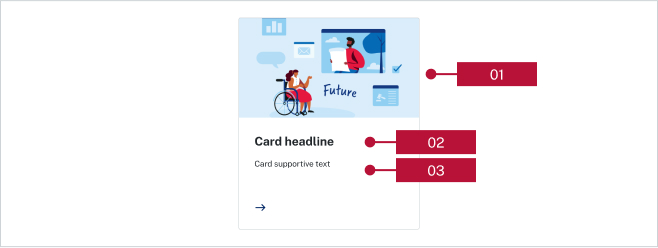
You can insert an image within a card to support your content. This can sit above or to the left of the content. When viewed on mobile, all images will sit above the content.
Group card components under a heading to ensure they fit within the semantic structure of the page. Do not use more than 12 cards under the same topic heading.
Cards can be used on:
They cannot be used on:
Last updated: