Automatic language translation
Our website uses an automatic service to translate our content into different languages. These translations should be used as a guide only. See our Accessibility page for further information.
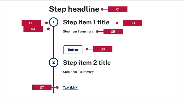
Steps visually indicate the process or status of a series of tasks and organise information for users. A call-to-action button or link can be used to guide users to the full content details.
Refer to NSW Digital Design System - Steps for full guidance and demo on how and when to use this.

A brand colour can be applied to the progress bar on the steps component, including brand dark, brand supplementary and brand accent. The inverse colour is brand light when it is placed inside a dark section.
Add a call-to-action for the step item to improve user engagement.
Steps can be used on:
They cannot be used on:
Last updated: